This blog post explains the progress I went though in order to create the website for my advertising campaign. Firstly I choice two contrasting images. Firstly I cut out the image of the students sat at a table working. In contrast I overlapped this with a n image of an man wearing dark clothes holding a knife. I also decided to base this all on a black background I did this for two main reasons. Firstly using dark image is a common code and convention amongst most horror advertising campaigns. Secondly as there is light reflecting of the knife it makes it stand out much clearer and therefore it becomes
  the most eye-catching aspect of the page. The next step was to add what would become the links on a full working advert. I chose to break up the links with small white bars this simplys makes the website look neater a better layed out. I also applied a bar with production titles at the bottom of the site. I also added a quote relevant to advertisement campaign. There also links out off the site to similar contents such as fansites facebook and
  twitter. This section would be continues throughout the site the only thing which would change would be the background image and the general contents of the page depending on what link they selected. I then overlapped these two sections together to create the layout for my homepage.
  I decided to add some last minute changes to the home page such as a slight fade to black around the edge of the image. I also added the title of the production and a date of realise.
 n image of an man wearing dark clothes holding a knife. I also decided to base this all on a black background I did this for two main reasons. Firstly using dark image is a common code and convention amongst most horror advertising campaigns. Secondly as there is light reflecting of the knife it makes it stand out much clearer and therefore it becomes
 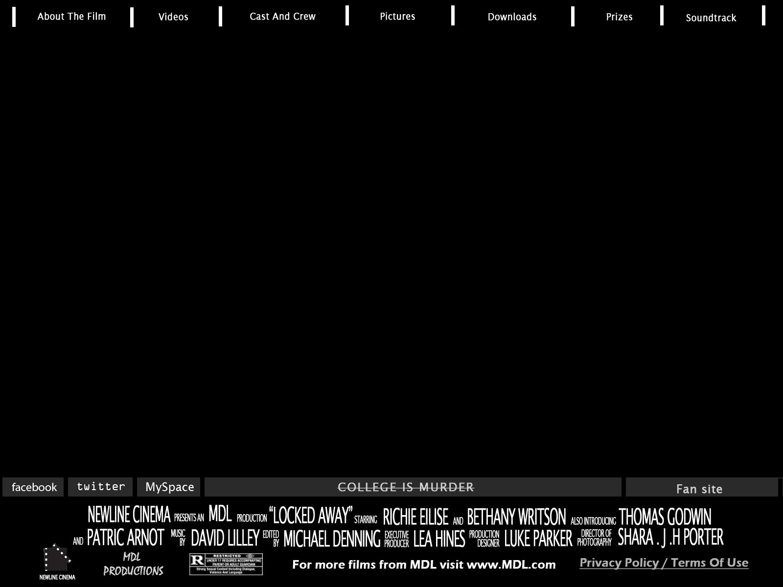 the most eye-catching aspect of the page. The next step was to add what would become the links on a full working advert. I chose to break up the links with small white bars this simplys makes the website look neater a better layed out. I also applied a bar with production titles at the bottom of the site. I also added a quote relevant to advertisement campaign. There also links out off the site to similar contents such as fansites facebook and
  twitter. This section would be continues throughout the site the only thing which would change would be the background image and the general contents of the page depending on what link they selected. I then overlapped these two sections together to create the layout for my homepage.
  I decided to add some last minute changes to the home page such as a slight fade to black around the edge of the image. I also added the title of the production and a date of realise.
No comments:
Post a Comment