Pre-production
How has my creativity developed though the use of digtal technolgy?
How has my creativity developed further though the use of digtal technolgy?
Dreamweaver
Book Reverences
Practice magazine cover
Links
Websites
Pre-Production Progress
AS Courcework
Production
Website Process
Magizine Process
Teaser Trailer
Magazine Front Cover
Radio Advert
Website Homepage
Location Stills
Production Stills
Progress so far
Post-Production
Audience Feedback
Evalutive Commentry
Friday 23 April 2010
Evaluative Commentary
My A2 coursework consists of four media products which make up an advertising campaign for the film “Locked Away”, a movie trailer, a radio advertisement, a magazine cover and the homepage for a website. The film “Locked Away” is horror set in a college after hours. Four students stay behind one day to get some work then but are soon being hunted down my knife wielding killer whom has a set of keys and complete control of all the colleges systems.


We had decided to try to follow and expand upon the codes and conventions which are generally associated with horror productions. Common features in horror productions are the use of a dark setting in order to add a sense of the unknown and therefore less control of the surroundings. This obviously cannot be represented within a radio production, however I believe it is shown in both my website and the trailer. My website is based on a plain black background with dark images on top; I then faded around the edge of the site to black. The opening sequences of the trailer consist of shots within a dark room (the camera is freehand in attempt to make it first person perspective) when the only source of light came from a torch apparently held by the villain.
Another common feature within horror advertising campaigns is the use of weapons. Across most forms of media a weapon is used to represent the intent and evil of the character wielding it. Across all of my productions apart from the radio advertisement the knife plays a large part of creating a horror atmosphere along with other aspects of mise en scene such as the keys which are used within the radio ad. In the trailer there is a shot of the villain dragging the knife along a wall. This shows how sharp and dangerous the knife is though both the camerawork of slowly zooming out from the tip and the sound of it dragging along the wall. This same shot is used for my magazine cover. The website consists of a shot of the students up to a table working and a man looking at them whilst holding a knife behind his back. The radio uses the sound of keys in such a way that it sounds as if the evil charter is coming closer.


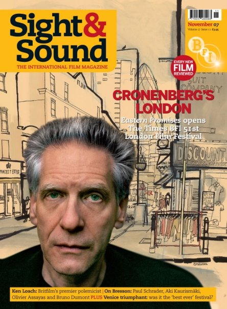
There are many things across my productions which are similar to that of real world practices. My magazine cover is based on the magazine ‘sight and sound’ as such I had to recreate the logo. I chose to base my on their most reason logo as it has changed many times over the years. I also copied the BFI logo as that is a feature in the newer editions. I have also used names from the common columnists in ‘sight and sound’ for my magazine cover. This way it will match as closely as possible to the real thing. In comparison to my website my magazine cover has a very simple layout. The website is based on a black background so that if it doesn’t cover the inter window the edges will match up to the default black the window would have. I applied two photos to the top of the background. One of the victims and the other of the killer. The photos are arranged with the killer higher in the frame and therefore more dominant; he also takes up more space in the frame then any of the victims, which reinforces this idea. He is positioned in a way with his back to the camera this gives the impression that he is watching the students who as none of them are reacting to his presence are clearly oblivious to his presence. This matches up to the beginning of the trailer were the students do not know that they are in danger. I have also chosen to use dimensions for my magazine cover which are used in all sight and sound magazines.


All of my advertising campaign in focused on one movie ‘Locked Away.’ This movie is aimed to have a 15 certificate due to scenes which some viewers may find distressing. The target audience would be students aimed between fifteen and twenty. This is due to restrictions because of the movies certificate and that this audience would have much more in common with the victims of this movie. Hammer Film Productions is one of the major horror film distributers in Britain and would be the most likely distributer of our film. They have been involved with some of the most famous horror films of all time such as ‘Dracula’ and ‘Frankenstein’ however they haven’t many films which are trying to relate to the younger generation and their fears, which or production dose.
Our audience would be able to relate to the situation of staying behind after college to get work done. They would also understand the idea that a college is a very freaky place to be when it’s empty as you are used to seeing it full with people. Then to further the idea of hopelessness we give the villain a set of keys which are used as a metaphor across all of the advertising campaign for the control he has other there environment and therefore them. I believe that the combination of my main task and my ancillary texts are very effective as I designed them to complement each other. Across all the texts apart from the website the keys are in clear view as is the knife. I chose to focus on these two aspects as they are what make the villain most deadly. They all also portray the villain in the same way. You never get a good look at his face so you don’t know who he is or why he’s doing what he’s doing; therefore there is no reasoning with him. I believe out of my four products the one which matches closes to the codes and conventions used in general media projects are my magazine. This may be because ‘sight and sound’ have a simple layout which is easy to mimic. In comparison the one I am least happy with is the teaser trailer. I feel that this could have been much closer to the codes and conventions commonly used in horror productions. We chose to record during the day rather than night because of time constrictions, I feel that if more of our scenes were darker it would increase the foreboding of the complete production. However the close up of the knife with the killers reflection in it was a very suitable shot and I am glad we went back to record it. The website homepage I am also happy with as I believe it works well in unison with the other pieces. However I would have liked more time to work on it in order to add links to it and possibly more pages. The radio advertisement was an interesting experience as they a becoming less and less frequent for movies and more commonly a means to advertise local business. Therefore I have little experience with what an advertisement on the radio should sound like.
The audience feedback was very helpful when it came to evaluating my work and brought up some interesting ideas which I had not yet considered. The website I was very pleased about and was glad to see that fading the image to black to match the background worked well. However I disagree that there is too much going on, perhaps there were a few too many links however it was laid out like my style model. I was also glad to see that it was laid out in a simple manner. This website was designed for fans not necessarily common computer users. The radio advert was a new concept for me and my group. After hearing it back I agree that the script could have done with some more work, however we were under very limited time constraints. The trailer took up the most of our time to produce as we had to go back and film more shots to be better suiting to our genre. I am glad to see that this has made a deference in the final product, although perhaps we should have done some more planning before hand in order to avoid it entirely. We chose to produce our own music for the trailer and the radio advert so we know we haven’t broken any copyright laws. I feel that rather than being a hindrance in our final product it has aided it. The magazine cover was very effective and seemed to match the style commonly used by sight and sound, I’m glad that it didn’t seem out of place. The most important thing which I have taken away from the audience feedback it that the younger people (16/17 year olds) seemed more likely to view the final product then the older audience. This is good as it gives evidence that my production has reached its target audience.
Another common feature within horror advertising campaigns is the use of weapons. Across most forms of media a weapon is used to represent the intent and evil of the character wielding it. Across all of my productions apart from the radio advertisement the knife plays a large part of creating a horror atmosphere along with other aspects of mise en scene such as the keys which are used within the radio ad. In the trailer there is a shot of the villain dragging the knife along a wall. This shows how sharp and dangerous the knife is though both the camerawork of slowly zooming out from the tip and the sound of it dragging along the wall. This same shot is used for my magazine cover. The website consists of a shot of the students up to a table working and a man looking at them whilst holding a knife behind his back. The radio uses the sound of keys in such a way that it sounds as if the evil charter is coming closer.


There are many things across my productions which are similar to that of real world practices. My magazine cover is based on the magazine ‘sight and sound’ as such I had to recreate the logo. I chose to base my on their most reason logo as it has changed many times over the years. I also copied the BFI logo as that is a feature in the newer editions. I have also used names from the common columnists in ‘sight and sound’ for my magazine cover. This way it will match as closely as possible to the real thing. In comparison to my website my magazine cover has a very simple layout. The website is based on a black background so that if it doesn’t cover the inter window the edges will match up to the default black the window would have. I applied two photos to the top of the background. One of the victims and the other of the killer. The photos are arranged with the killer higher in the frame and therefore more dominant; he also takes up more space in the frame then any of the victims, which reinforces this idea. He is positioned in a way with his back to the camera this gives the impression that he is watching the students who as none of them are reacting to his presence are clearly oblivious to his presence. This matches up to the beginning of the trailer were the students do not know that they are in danger. I have also chosen to use dimensions for my magazine cover which are used in all sight and sound magazines.

All of my advertising campaign in focused on one movie ‘Locked Away.’ This movie is aimed to have a 15 certificate due to scenes which some viewers may find distressing. The target audience would be students aimed between fifteen and twenty. This is due to restrictions because of the movies certificate and that this audience would have much more in common with the victims of this movie. Hammer Film Productions is one of the major horror film distributers in Britain and would be the most likely distributer of our film. They have been involved with some of the most famous horror films of all time such as ‘Dracula’ and ‘Frankenstein’ however they haven’t many films which are trying to relate to the younger generation and their fears, which or production dose.
Our audience would be able to relate to the situation of staying behind after college to get work done. They would also understand the idea that a college is a very freaky place to be when it’s empty as you are used to seeing it full with people. Then to further the idea of hopelessness we give the villain a set of keys which are used as a metaphor across all of the advertising campaign for the control he has other there environment and therefore them. I believe that the combination of my main task and my ancillary texts are very effective as I designed them to complement each other. Across all the texts apart from the website the keys are in clear view as is the knife. I chose to focus on these two aspects as they are what make the villain most deadly. They all also portray the villain in the same way. You never get a good look at his face so you don’t know who he is or why he’s doing what he’s doing; therefore there is no reasoning with him. I believe out of my four products the one which matches closes to the codes and conventions used in general media projects are my magazine. This may be because ‘sight and sound’ have a simple layout which is easy to mimic. In comparison the one I am least happy with is the teaser trailer. I feel that this could have been much closer to the codes and conventions commonly used in horror productions. We chose to record during the day rather than night because of time constrictions, I feel that if more of our scenes were darker it would increase the foreboding of the complete production. However the close up of the knife with the killers reflection in it was a very suitable shot and I am glad we went back to record it. The website homepage I am also happy with as I believe it works well in unison with the other pieces. However I would have liked more time to work on it in order to add links to it and possibly more pages. The radio advertisement was an interesting experience as they a becoming less and less frequent for movies and more commonly a means to advertise local business. Therefore I have little experience with what an advertisement on the radio should sound like.
The audience feedback was very helpful when it came to evaluating my work and brought up
 some interesting ideas which I had not yet considered. The website I was very pleased about and was glad to see that fading the image to black to match the background worked well. However I disagree that there is too much going on, perhaps there were a few too many links however it was laid out like my style model. I was also glad to see that it was laid out in a simple manner. This website was designed for fans not necessarily common computer users. The radio advert was a new concept for me and my group. After hearing it back I agree that the script could have done with some more work, however we were under very limited time constraints. The trailer took up the most of our time to produce as we had to go back and film more shots to be better suiting to our genre. I am glad to see that this has made a deference in the final product, although perhaps we should have done some more planning before hand in order to avoid it entirely. We chose to produce our own music for the trailer and the radio advert so we know we haven’t broken any copyright laws. I feel that rather than being a hindrance in our final product it has aided it. The magazine cover was very effective and seemed to match the style commonly used by sight and sound, I’m glad that it didn’t seem out of place. The most important thing which I have taken away from the audience feedback it that the younger people (16/17 year olds) seemed more likely to view the final product then the older audience. This is good as it gives evidence that my production has reached its target audience.


New media technologies were vital in the production of this year’s coursework. Within the preproduction stage the most useful was perhaps the use of web 2.0. Web 2.0 site such as YouTube allowed us to view recent teaser trailers for horror movies. This was very helpful in the planning of not only our trailer but also the whole advertising campaign. I used many technologies in the production of my work. The most obvious of which is video and digital cameras, which allowed us to capture the footage for our production and take production stills. It also allowed us to take photos used in the magazine front cover and website homepage. During the editing I used ‘Adobe, Premier Pro’ to edit the footage into a movie. We also had use of a sound studio to capture the sound effects and music used in our trailer. It also let us capture the voice over’s for both the radio advert and the trailer. ‘Photoshop’ was the most useful software when it came to editing the pictures for my website and magazine cover. It allowed me to crop them to size and layout the entire document. It also allowed me to setup the text how I needed it to be. I also used ‘Dreamweaver’ for my website to set it up into the right format. In the evaluation of my work ‘Facebook’ (which is another web 2.0 site) was useful in presenting my product to an audience. However ‘Blogger’ and ‘Google Documents’ are perhaps the most useful of these technologies as they allowed me to present all of my work online in an organised and tidy way.
Audience Feedback
The following is a list of audience feedback which has been moderated to only contain relevant comments. I have chosen not to use the people’s names as this is on blogger and I wish to keep their identities secure.
I felt that the magazine was of a simple layout which worked. There was too much going on with the website and this took away from its overall impact.
‘Female 17’
The trailer could have been better. The music wasn’t so much scary as freaky and although some of the shots were good, many of them just didn’t seem to suit the feel of the movie.
‘Male 18’
The script for the radio advert sounded like it needed some more work. It was a good idea but some of the lines were less scary and more comical.
‘Male 26’
The website was very well laid out. The fade to black around the central picture worked well and using bars to break up the links in the bars made it look much clearer and easier to use.
‘Female 34’
The pictures were very good. The edges were cropped cleanly and they were well positioned. I particularly like the one on the website; it looks as if the killer is staring down at the students.
‘Female 16’
I felt the trailer worked well. I would defiantly want to watch this film to find out what’s happening.
‘Male 17’
I’m not sure if I’d want to go watch this. It just doesn’t seem to be all that scary to me.
‘Male 42’
Magazine process

For the magazine I used a image with a plain background as my  background image and added on top of that. Firstly I re-sized it so that it fitted the size which is commonly used in 'Sight and Sound' magi zines. Next i added the yellow background for the text boxes. To do this I overlapped my image with a copy of sight and sound whilst being on the background layer I highlighted the edges of these boxes to make a perfect match. I used the same method to create the sight and sound logo. The bar code and BFI logo i got of the Internet however I had to crop the BFI lo
 go to fit in with the colour of the background. Finally I added the headings which have been done in a style not out of place on a copy of sight and sound. I also used the names of columnists from the magazine so that it was as close as possible to the real thing. Finally I added the sticker to make it seem as realistic as possible.
 background image and added on top of that. Firstly I re-sized it so that it fitted the size which is commonly used in 'Sight and Sound' magi zines. Next i added the yellow background for the text boxes. To do this I overlapped my image with a copy of sight and sound whilst being on the background layer I highlighted the edges of these boxes to make a perfect match. I used the same method to create the sight and sound logo. The bar code and BFI logo i got of the Internet however I had to crop the BFI lo
 go to fit in with the colour of the background. Finally I added the headings which have been done in a style not out of place on a copy of sight and sound. I also used the names of columnists from the magazine so that it was as close as possible to the real thing. Finally I added the sticker to make it seem as realistic as possible.

Subscribe to:
Posts (Atom)